

We code software that makes you more money...

Copyright © Appify WP · All Rights reserved · Email us: contact@appifywp.com
People used to focus on creating and using projects that had a nice user interface (UI) only a few years ago. Websites such as usability.gov have even created guides that teach user interface design basics. Programmers used to work with talented graphics designers, who were creating series of great looking images/virtual pages and design elements, making sure that they are pleasing to the eye and incorporate all the needed functionality. In fact, many teams continue to follow this apparently correct, and yet outdated methodology even today!
However, modern software development teams focus on designing projects that provide a great user experience (UX), rather than building nice looking user interfaces, which may be pleasing to the eye, but aren't intuitive. It’s a methodology which focuses on making the users have a great experience while interacting with your software application.
However, modern software development teams focus on designing projects that provide a great user experience (UX), rather than building nice looking user interfaces, which may be pleasing to the eye, but aren't intuitive. It’s a methodology which focuses on making the users have a great experience while interacting with your software application.

How to design a project that offers a great UX


Software developers need to be more flexible while focusing on UX, because they have to develop the application taking into account the end users’ insights, rather than their own ideas and designs. This could pose some serious problems. Here are a few examples that were derived from real-life situations.
1. The different types of users
Some companies know their end users’ typical profiles quite well. There are businesses which sell their audio books to single moms, to give you an example. However, things aren’t always this easy. How should you move on when the task is to redesign a general news website, which is visited by people aged 12 to 90, with various levels of education and income?
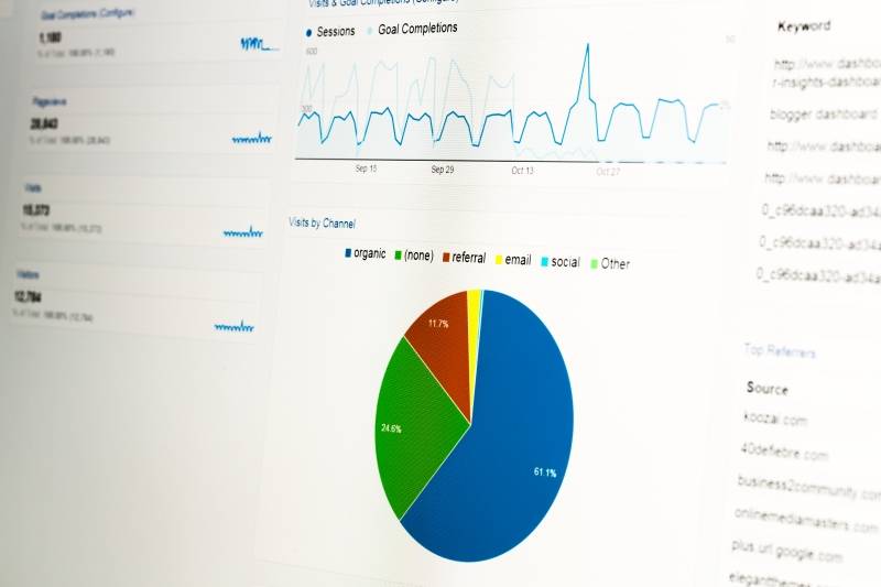
Fortunately, there are several web analytics tools that can segment users based on their location, gender, age, time zone, and more. Tools like these are invaluable, because they can offer precious insight, which helps software dev teams design an application that provides a customized user experience, based on the actual user profile.

It is more work, because the team has to design several variants of the same page, but by doing this, the user experience will significantly improve.
2. The limited number of users
If you want to focus on user experience, you will need to examine the users’ journeys for as many cases as possible. It’s easy to do that if the user base is big enough. Using the example above, a news website that receives tens of thousands of visitors per day will provide enough data to take a fast, and yet educated decision.
However, things change for the worse if the website only receives a few hundreds of visitors per month. How many months should you collect data before moving on to the next stage of the project?
Many business owners have already installed an analytics suite, perhaps Google Analytics, so you can get some insight by examining what their previous visitors did. However, if your team needs to develop a software application, rather than a website, you won’t have access to this info.
3. The number of needed iterations
The idea is to do your best and validate any assumptions as quickly as possible. It may sound counterintuitive to do it this way, but any assumption, even one that proves to be wrong, is better than waiting. Why? Because a wrong assumption will prove itself to be bad sooner or later - hopefully sooner - and will prevent the team from wasting time/and or money by going in a wrong direction.
Once that you are moving in the right direction and the company is happy with the results, it’s time to move on to the second iteration of the project. At this stage, a better prototype will be built - one that is richer in features.
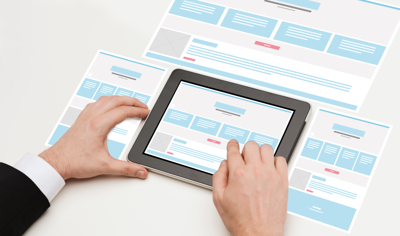
Let's use our website example once again. If it is fully functional now, it's time to test various designs for the website menu (top, sideway, etc), colors, fonts, graphics elements, and more. If the project is a mobile-ready website, it’s time to improve the project in a way that maximizes screen estate for a large range of mobile devices.

Additional fine-tuning features could include an automatic font increase if the detected user has an approximate age of over 50, visual hints for people who don’t seem to understand the next step or action that is expected from them, and more.
Always choose a team that focuses on creating a fantastic user experience, rather than using outdated, user interface-based methodologies. By doing this, your business profits will increase, and your customers will be thankful as well.
Always choose a team that focuses on creating a fantastic user experience, rather than using outdated, user interface-based methodologies. By doing this, your business profits will increase, and your customers will be thankful as well.